The Unphotogenic Syllabus: Design Lessons from Tokyo's Coin Laundries and Concourses
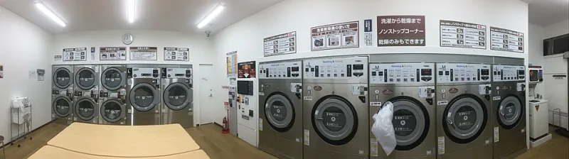
Photo: Nesnad, CC BY 4.0, via Wikimedia Commons
The best design classroom in Tokyo does not have a gift shop. It has fluorescent lights, a change machine, and a laminated sign about not leaving your laundry in the drum. It is not photogenic. That is the point.
I am not against the famous spots. The Shibuya crossing is a genuine piece of urban choreography. The Tokyo Metropolitan Government Building observatory is free and strange and worth the elevator. But those places have been optimized for being looked at. The places that teach me the most are the ones that have been optimized for being used.
In 2026, Tokyo is still full of ordinary rooms that do unglamorous work with unusual care. Here are three field notes from the least photogenic corners of the city, and what they might teach an American reader who is trying to notice design without turning every experience into content.
Field note 1: The coin laundry in Koenji
The laundromat near the station is not a lifestyle brand. It is a row of machines, a folding table, a sink, and a wall of instructions. What makes it work is the signage hierarchy. The first sign tells you how to pay. The second tells you which machines are available. The third tells you what not to put in the dryer. None of them are beautiful. All of them are in the order you need them.
That is a design lesson you can take home. Most home-office clutter is a signage problem. We label things by category—'taxes,' 'miscellaneous,' 'to file'—instead of by sequence. The laundromat labels by sequence: pay, load, dry, fold, leave. A drawer labeled 'the thing I need before I leave the house' will outperform a drawer labeled 'accessories' every time.
The laundromat also has a built-in recovery path. If you put the wrong coin in, there is a refund button. If a machine is broken, there is a handwritten note with a date and a phone number. The system assumes you will make a mistake. That is more generous than most American home offices, which assume you will remember where you put the warranty.
Field note 2: The Shinjuku subway concourse
Subway concourses are not designed to be photographed. They are designed to be survived. The good ones—and Tokyo has many—use color, repetition, and light to make a complicated underground space feel recoverable.
The first thing I notice is the repetition. The same line color appears on the pillar, the sign, the map, and the floor marker. You do not have to read a sentence to know where you are. The second thing is the lighting. The exits are brighter than the platforms. That sounds obvious, but it is a choice. Brightness becomes a wayfinding cue without a single word.
The third thing is the recovery. If you take the wrong exit, you can usually see the right one from outside. The system is designed for interrupted attention—the state most of us are in when we are trying to leave a building. That is a useful test for any layout. Can someone who is tired, carrying a bag, and slightly lost find their way back? If not, the design is not finished.
For a US reader, this translates to hallway closets, entryways, and the path from the front door to the desk. The best entryway is not the one with the prettiest console table. It is the one where a tired person can drop keys, mail, and a coat without making a decision. The subway concourse understands that. Most homes do not.
Field note 3: The old shopping arcade in Adachi
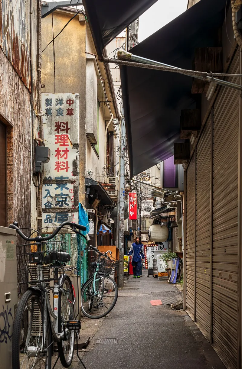
The arcade is not a design museum. It is a covered street with shops that have been there for decades. The awnings do not match. The handwritten signs are taped to the glass. Someone has put a stool outside a shop because the shopkeeper likes to sit there. Someone else has added a plastic crate for deliveries. It is a mess, and it works.
The lesson is improvisation. A good system lets the people who use it edit it. The arcade has a shared roof and a shared floor, but each shop solves its own frontage. The result is not coherent in the way a brand manual is coherent. It is coherent in the way a neighborhood is coherent: you can tell that humans have been adjusting the space to their actual lives.
That is the opposite of the optimized-for-the-feed approach, where every corner has one correct arrangement and the correct arrangement is the one that photographs best. The arcade is not trying to be a backdrop. It is trying to sell rice crackers and get people out of the rain. The design follows the use.
How to look at an unphotogenic place
You do not need to go to Tokyo to practice this. You need to stop asking 'is this interesting?' and start asking 'what decision is this place making for me?'
A few prompts I use:
- Count the decisions. How many choices does the space ask you to make before you can do the thing you came to do?
- Look for repairs. A piece of tape over a button is a design note from the real world.
- Follow the sightlines. What can you see from where you are standing? What has been hidden, and why?
- Notice what is missing. No trash can? No bench? No sign? That absence is a choice too.
- Ask who gets to edit. Can a shopkeeper move a stool? Can a resident add a plant? If not, the design is probably too rigid.
The famous spots in Tokyo will still be there. They are worth seeing. But the city's sharper design lessons are in the rooms that never asked to be looked at. A laundromat will not give you a good photo. It will give you a better way to label a drawer. That is a fair trade.